

Branding Low
Client
Welle Decor
again
2018
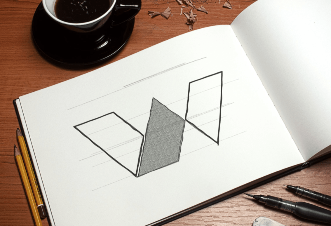
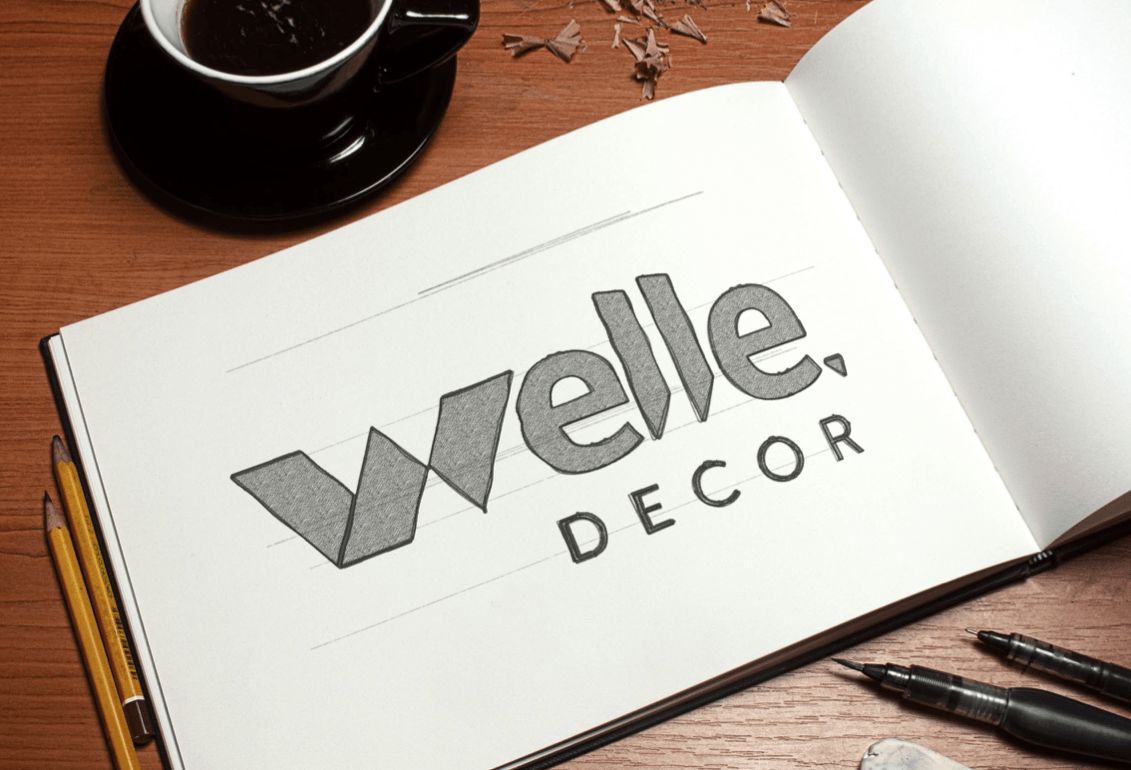
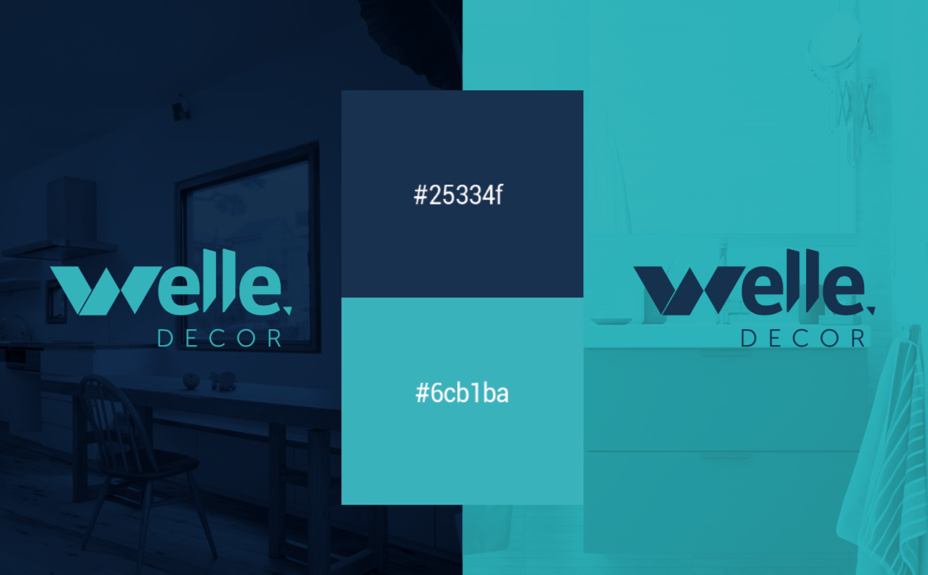
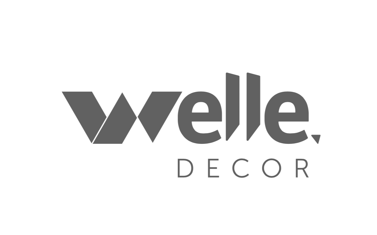
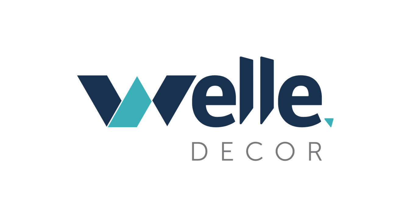
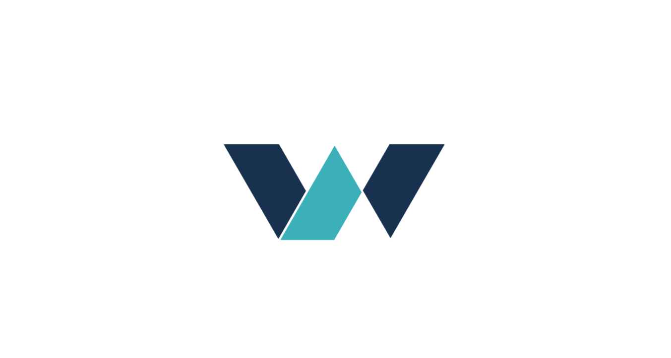
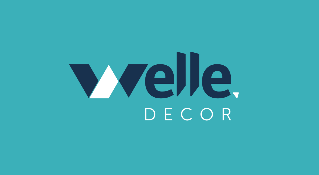
Welle Decor, importer of luxury decoration items, hired us to create its logo and visual identity. With the strong name of German origin, Welle, it means wave, the transforming force of water, since the products are metals for humid areas. The focus of the brand is the name itself, with the W symbolizing the movement of water, the tide in ups and downs. The detail in the Ls at the end, refer to buildings and constructions. The final point is a reference to the horizon, the baseline that sustains the brand, showing its way of thinking: seeking higher levels (waves), but without taking your feet off the ground.
Jobs
BRANDING LOW Application Manual Repositioning Suggestions for Mockups

Our values
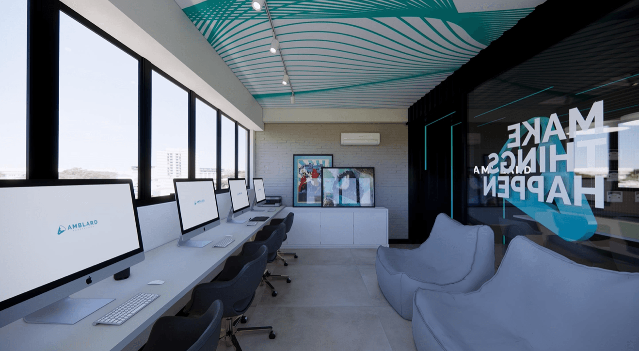
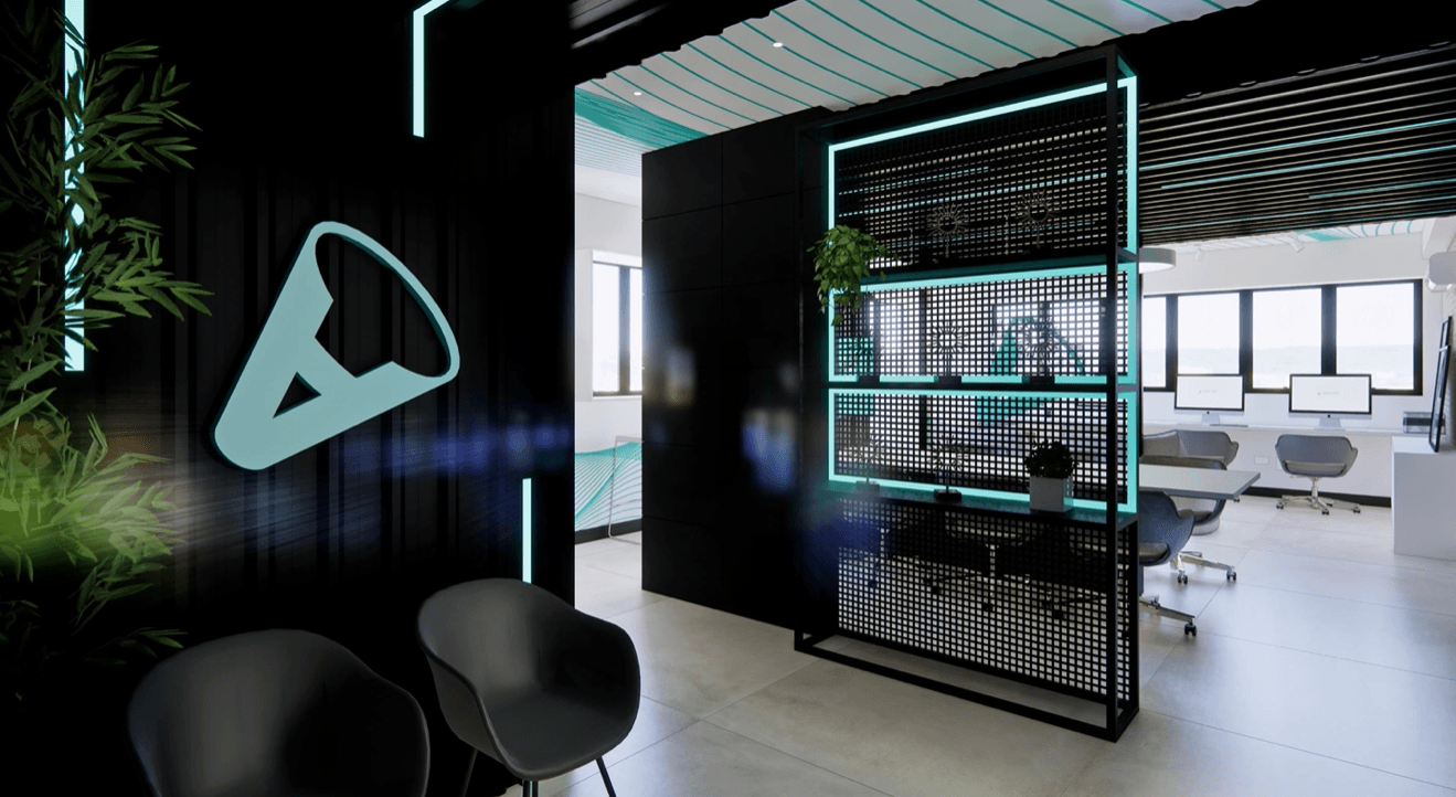
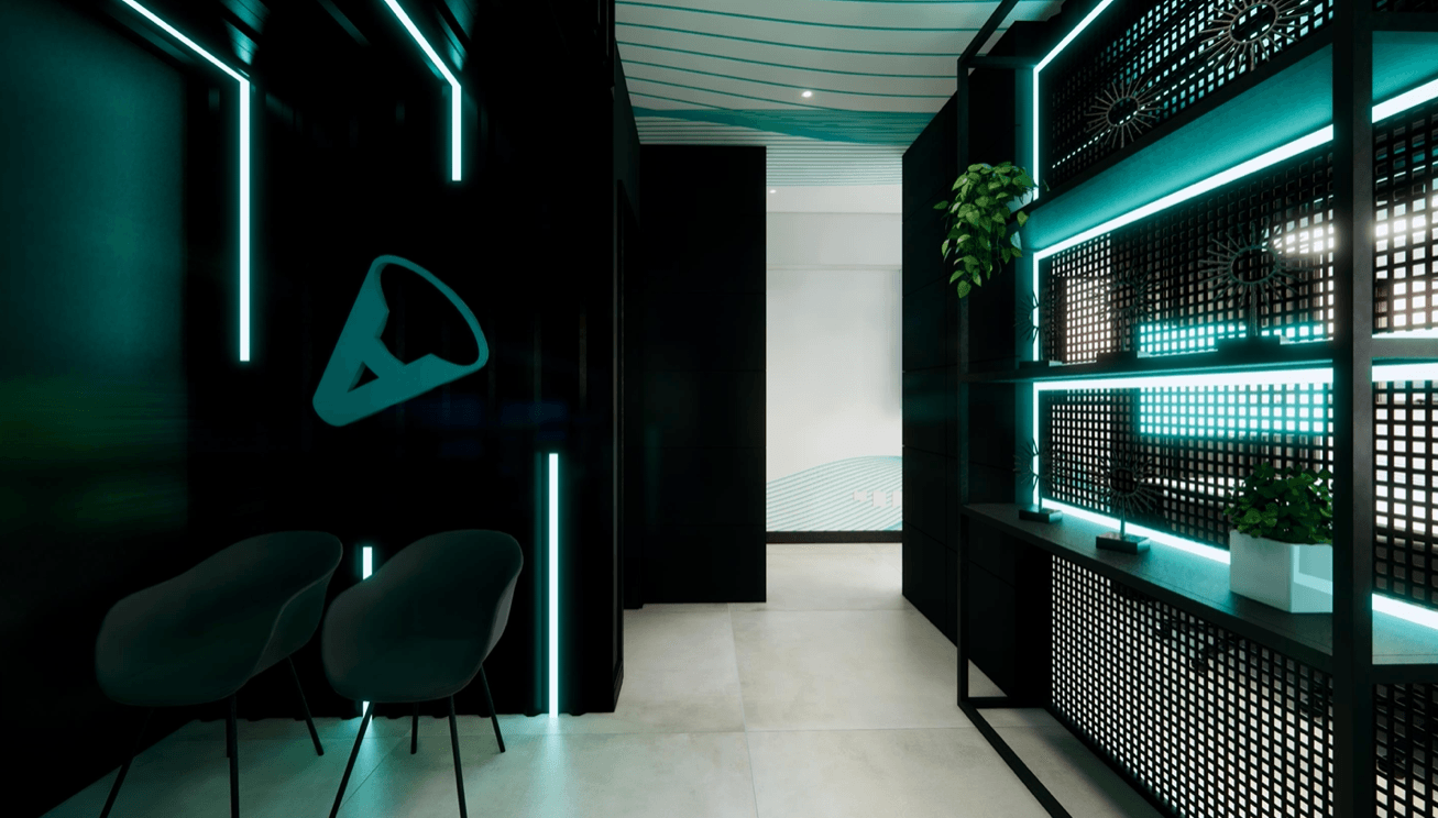
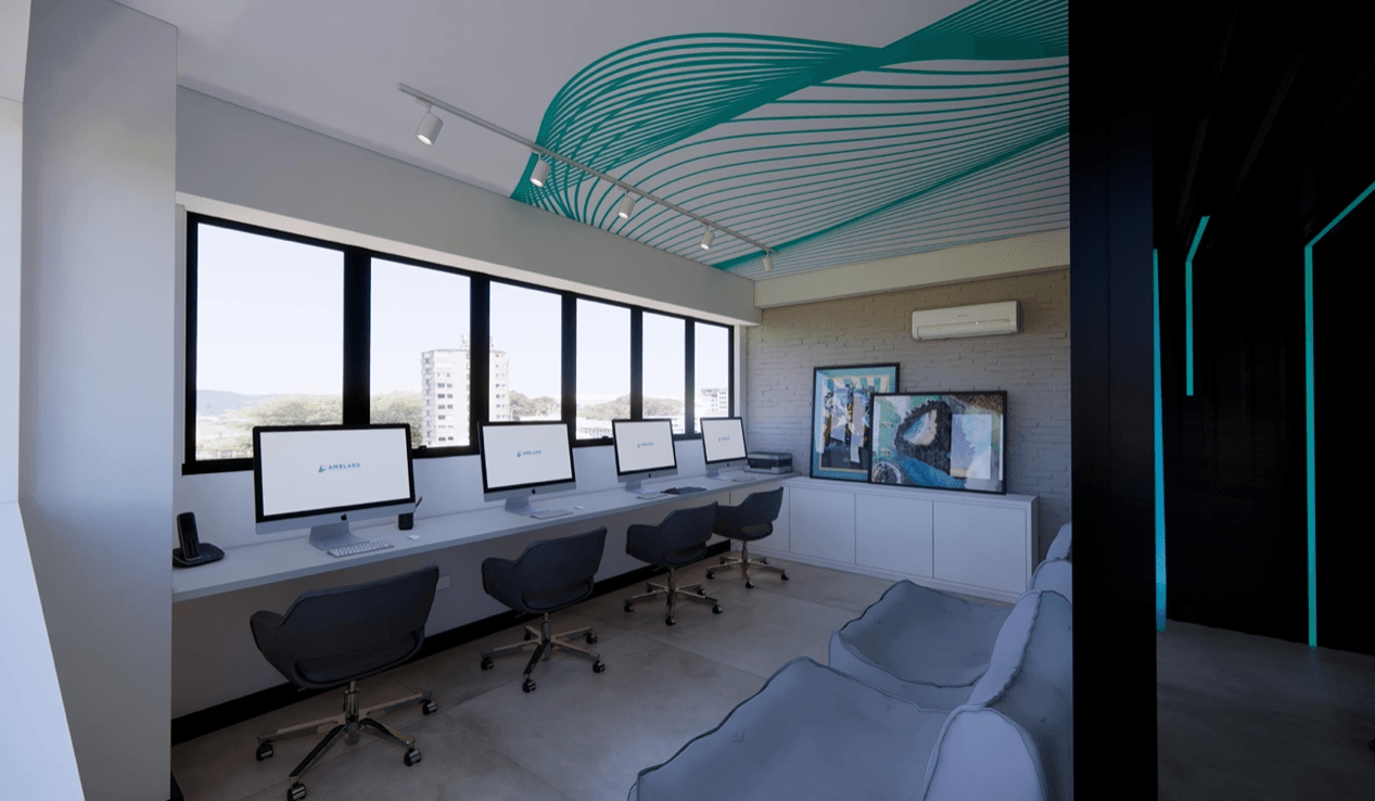
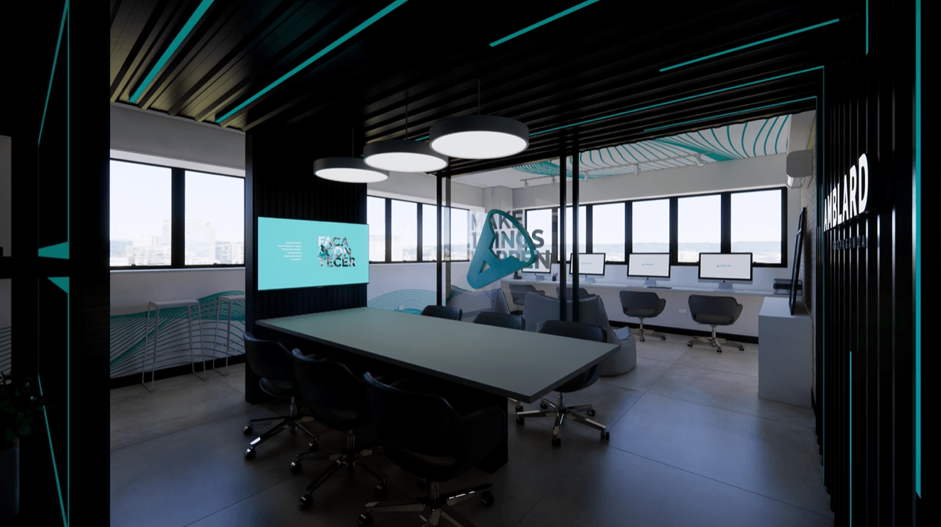
About Us
Its challenge is to remain relevant in its area of activity, as a reference for innovation, technology, practicality and sustainability. Amanda loves her clients, works exclusively for each one of them and spares no effort to come up with the ideal and most innovative decoration according to the client's style.
DATASHEET
Client - Notre Dame Jobs - Branding Relationship Mkt Campaigns Service - Caroline Amblard Creative Director - Marcio Amblard Dir. of Art - Augusto and Marcio Approval - Alexandre
Is your brand positioned correctly?
Have a branding that represents your company and create passionate about it.
< previous project
Next project >