

Branding
Client
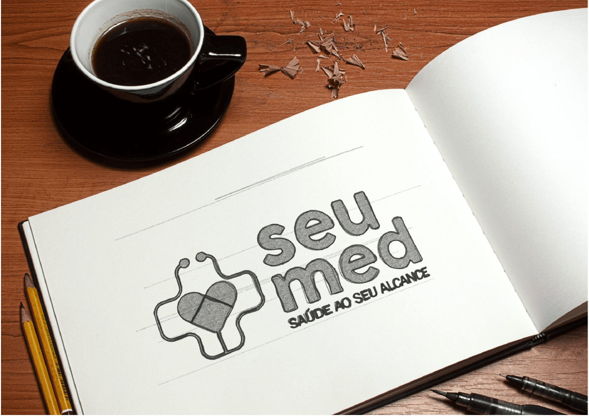
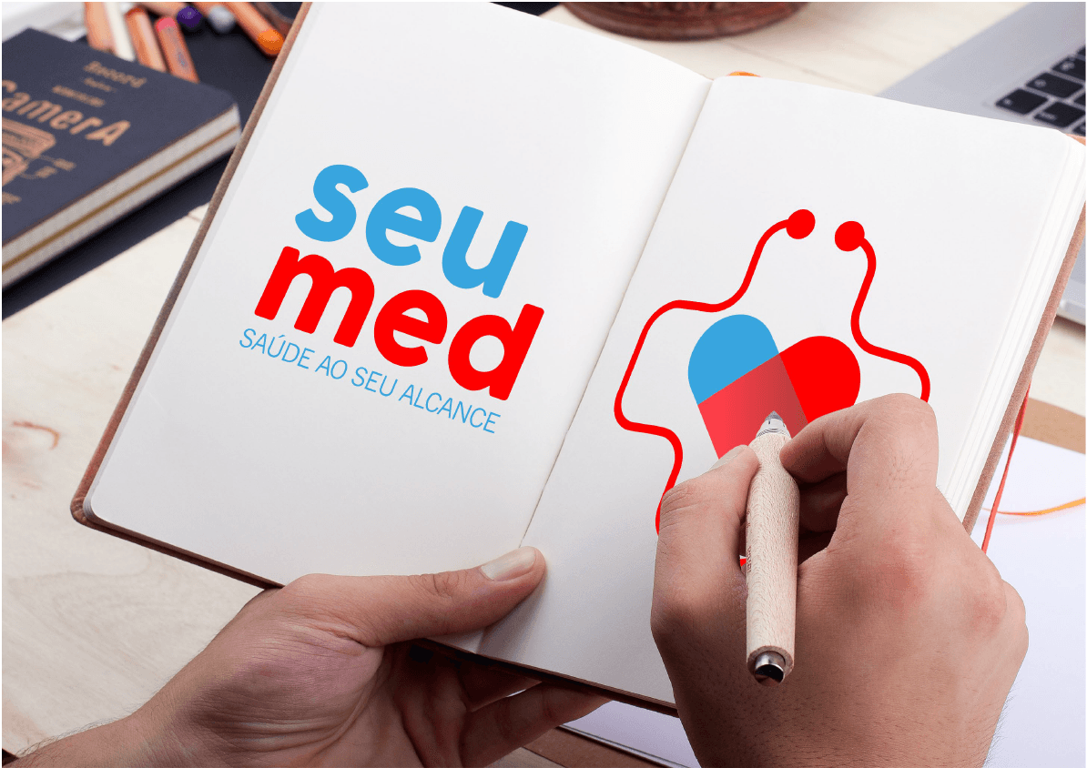
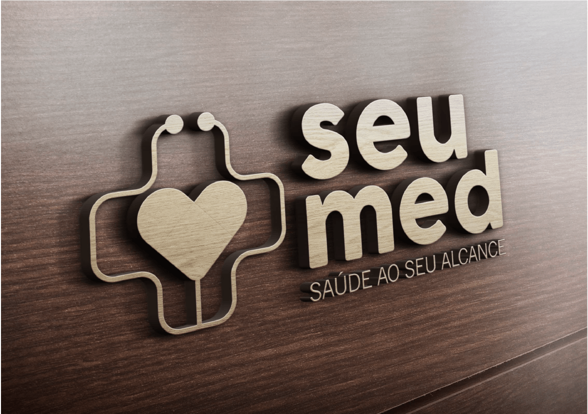
Seumed
again
2018
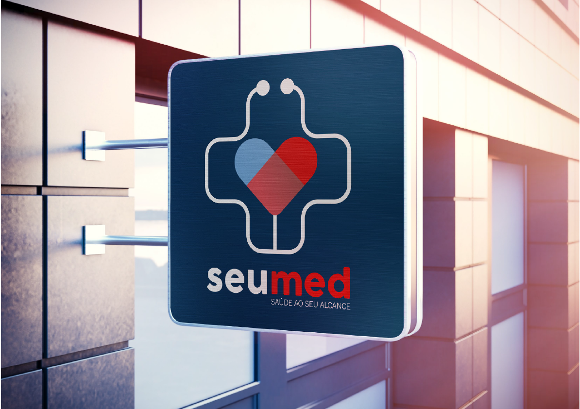
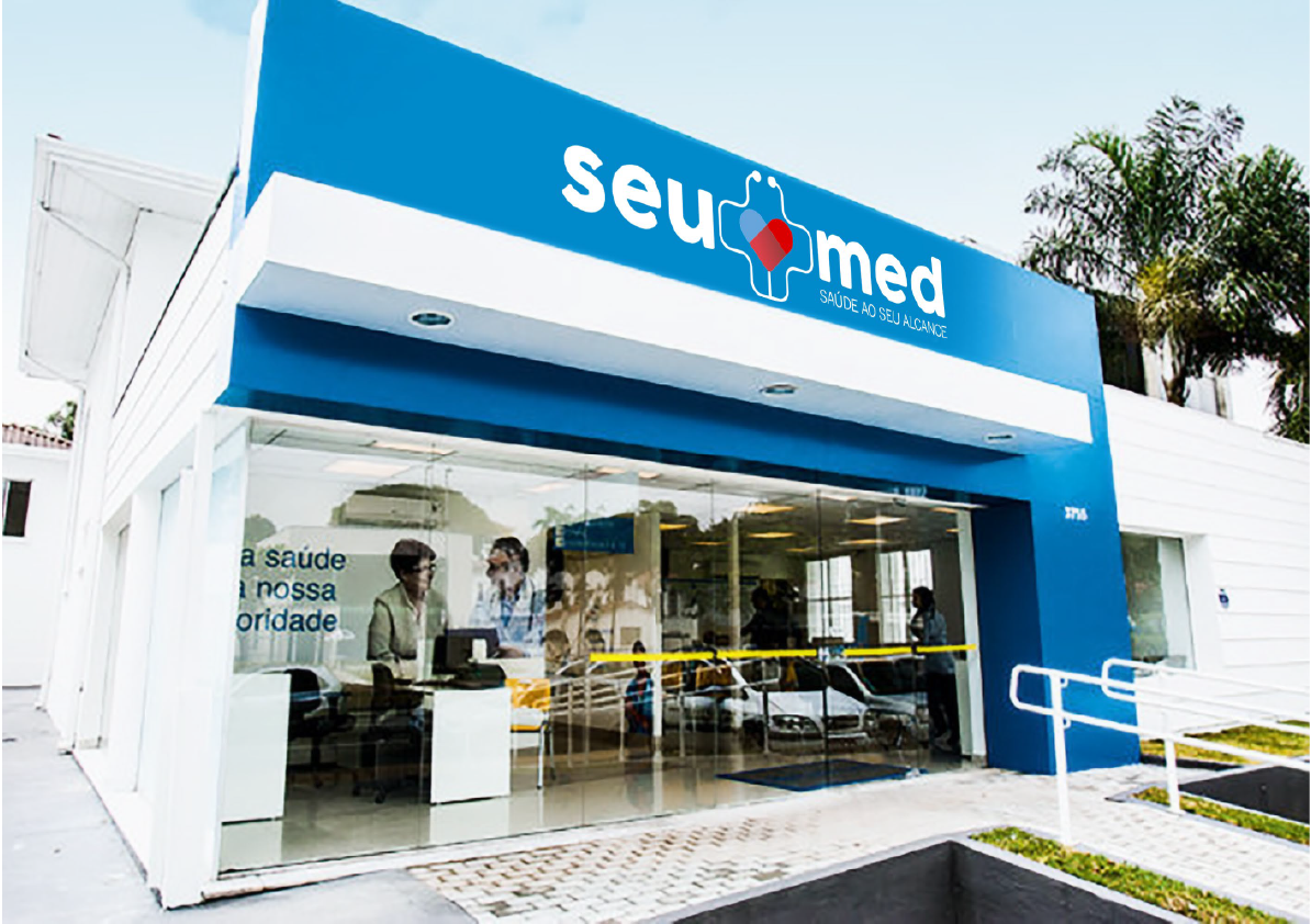
The SeuMed popular clinic is coming to Maringá. We had the privilege of participating in the conception of the name, choice of the slogan and we also made a beautiful brand. The concept represents a popular clinic, health within everyone's reach, as written in the slogan. The symbols refer to service and care. The heart formed by two halves that complete each other, surrounded by a stethoscope, representing the care that the clinic has for its clients, offering consultations of various types at affordable prices. Blue and red colors also convey the sense of well-being, care and health.
Jobs
BRANDING LOW Application Manual Repositioning Suggestions for Mockups Naming

Our values
DATASHEET
Client - Notre Dame Jobs - Branding Relationship Mkt Campaigns Service - Caroline Amblard Creative Director - Marcio Amblard Dir. of Art - Augusto and Marcio Approval - Alexandre
Is your brand positioned correctly?
Have a branding that represents your company and create passionate about it.
< previous project
Next project >