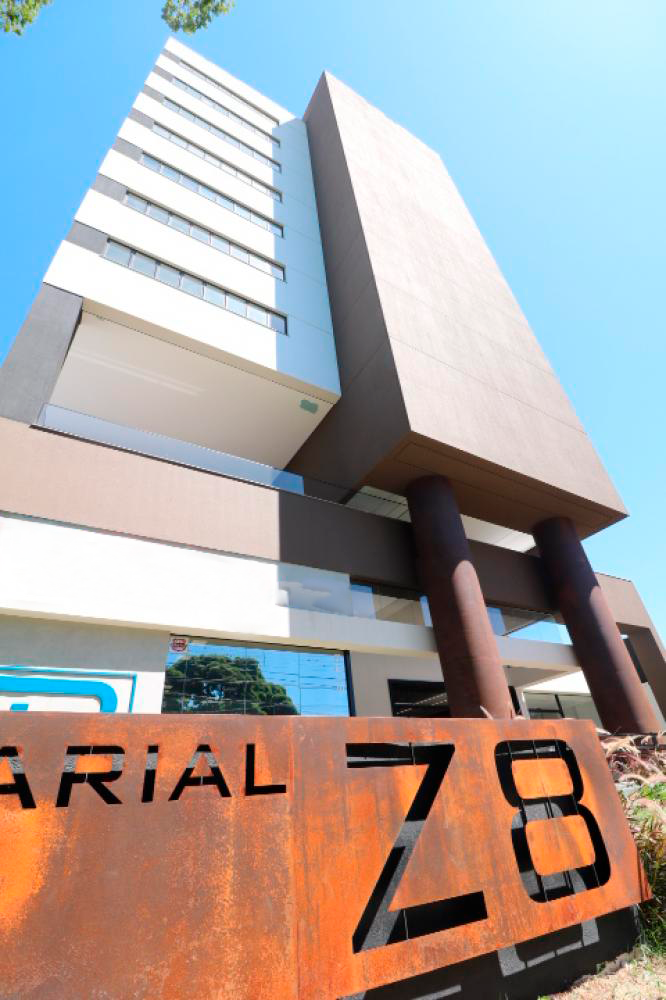


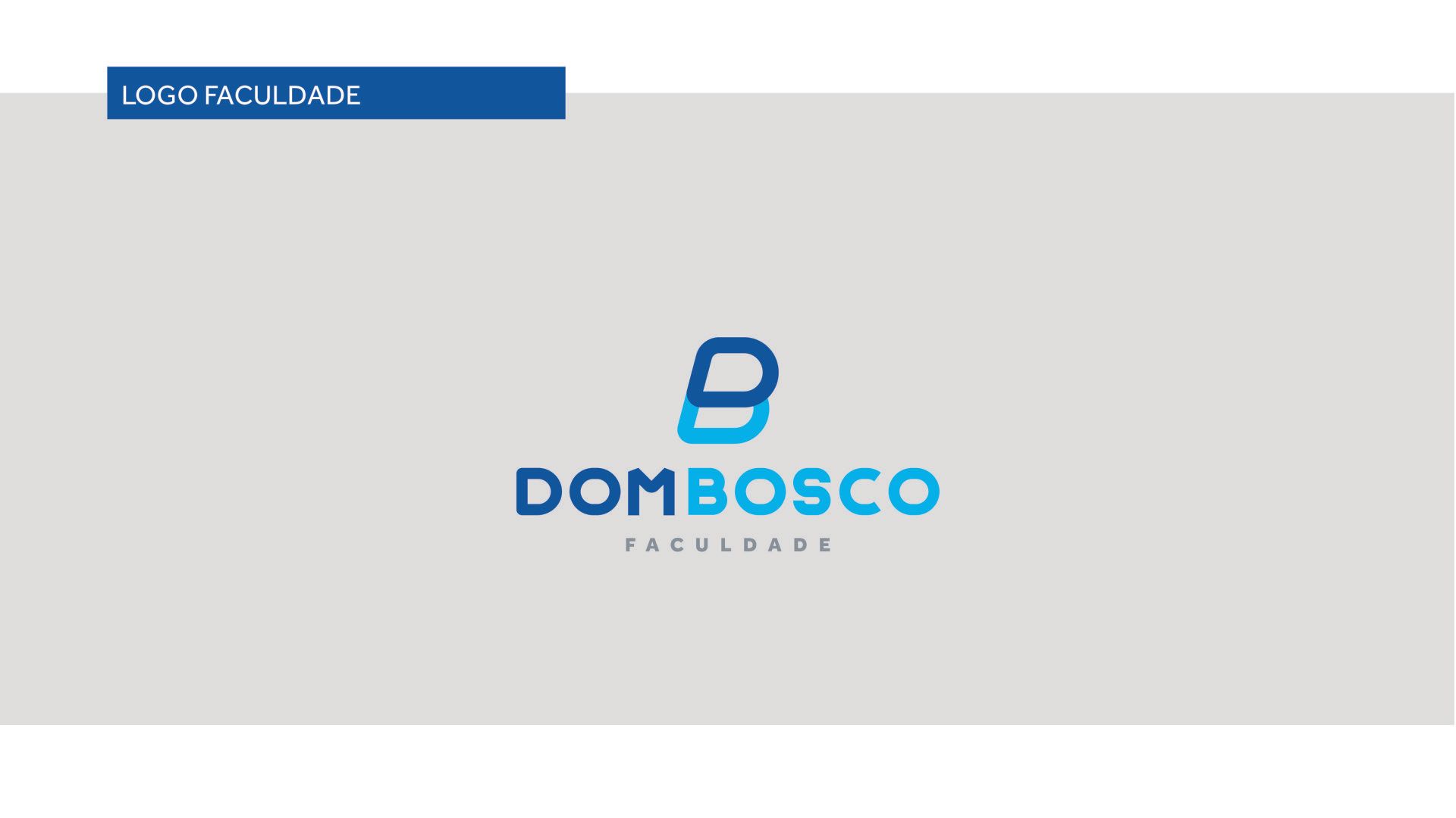
Dom Bosco
Client
Dom Bosco
again
2020
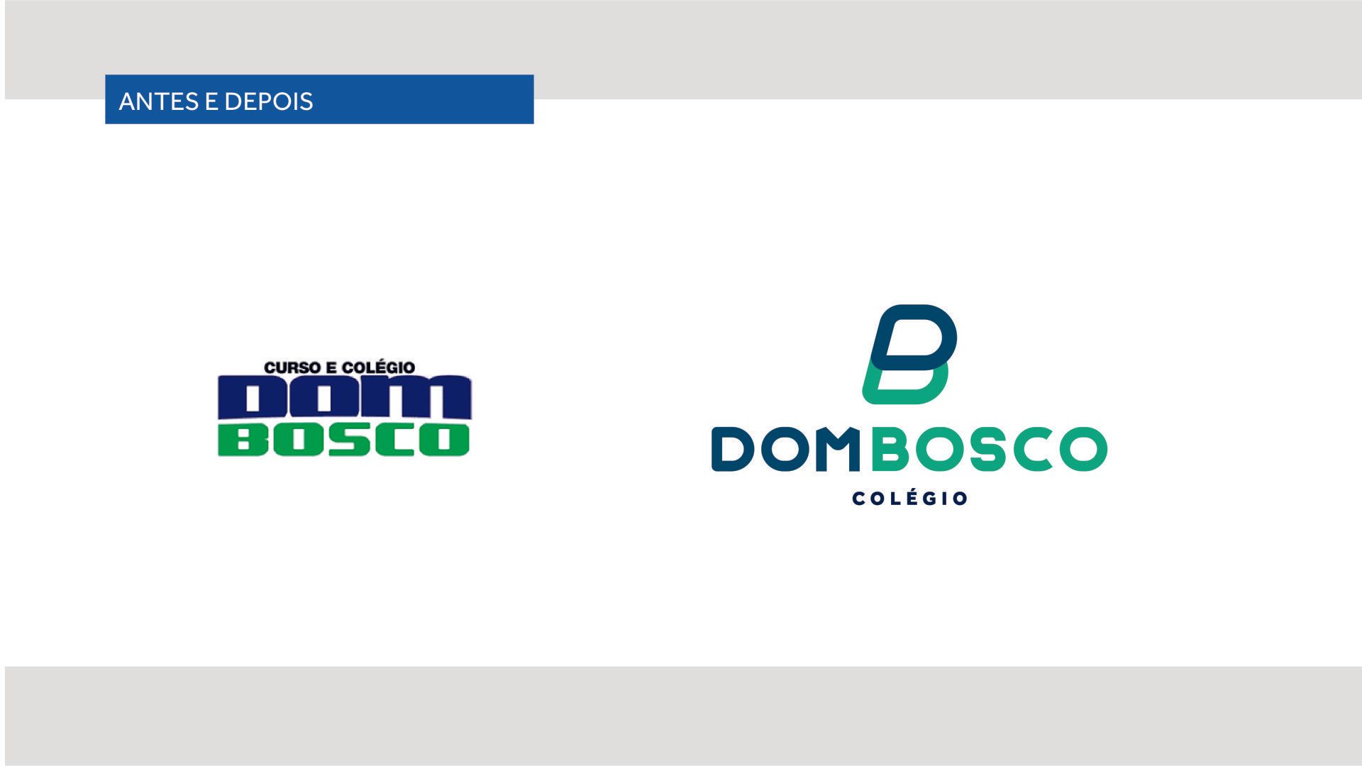
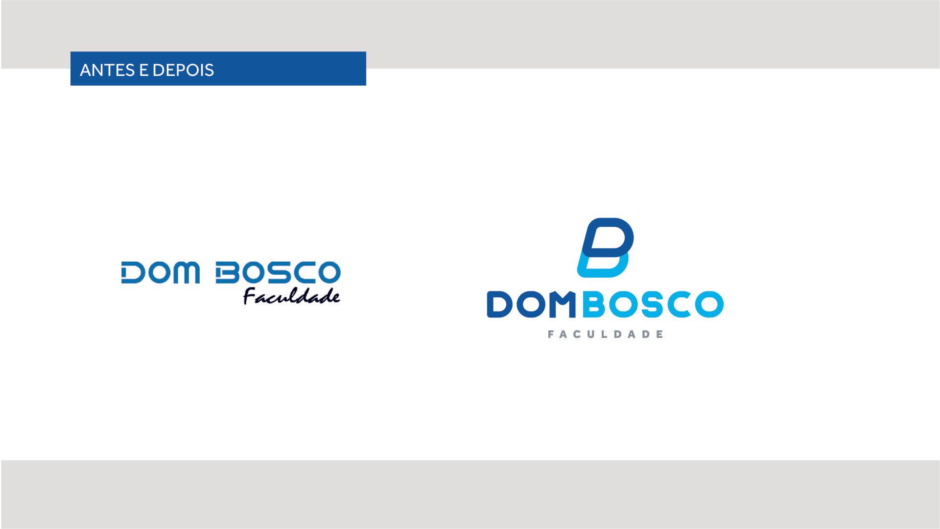
Within its educational proposal and considering the way in which technological advancement has an effect on children and young people, the teaching direction and coordination opted to innovate the traditional way maintained until then, seeking to add greater value to the contents taught. The implementation of the COC System required a high investment in technologies inside and outside the classrooms, an investment that was offset by assistance in training, professional recycling and constant updating of knowledge of the entire teaching team, preparing them to teach dynamically, without losing the quality our students deserve. The New Branding and Positioning brings everything the brand represents, a modern, unique and technological brand.
branding but
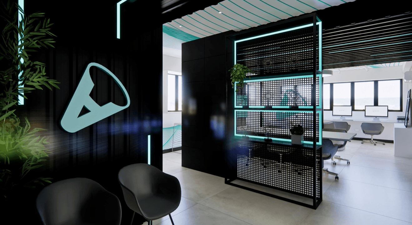
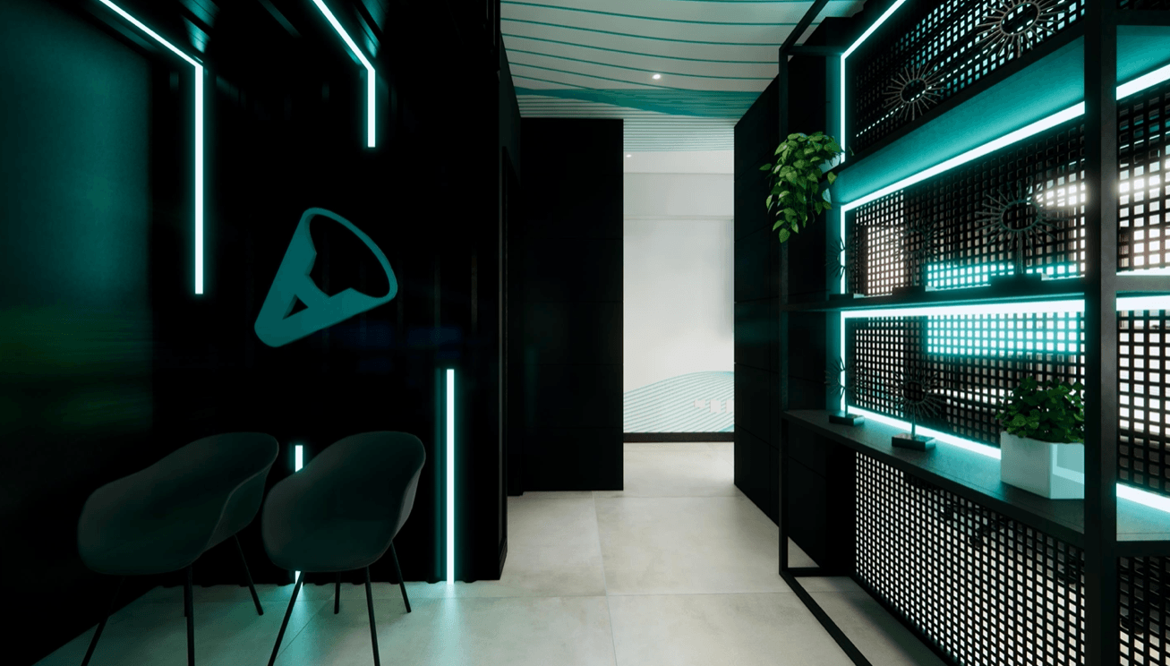
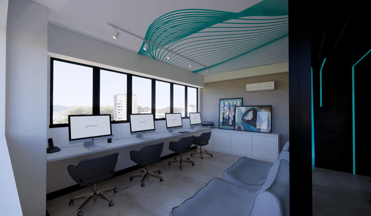
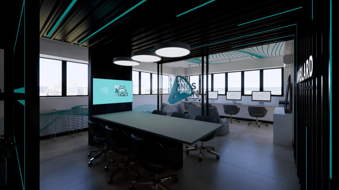
Brand Repositioning Relationship Marketing Campaigns
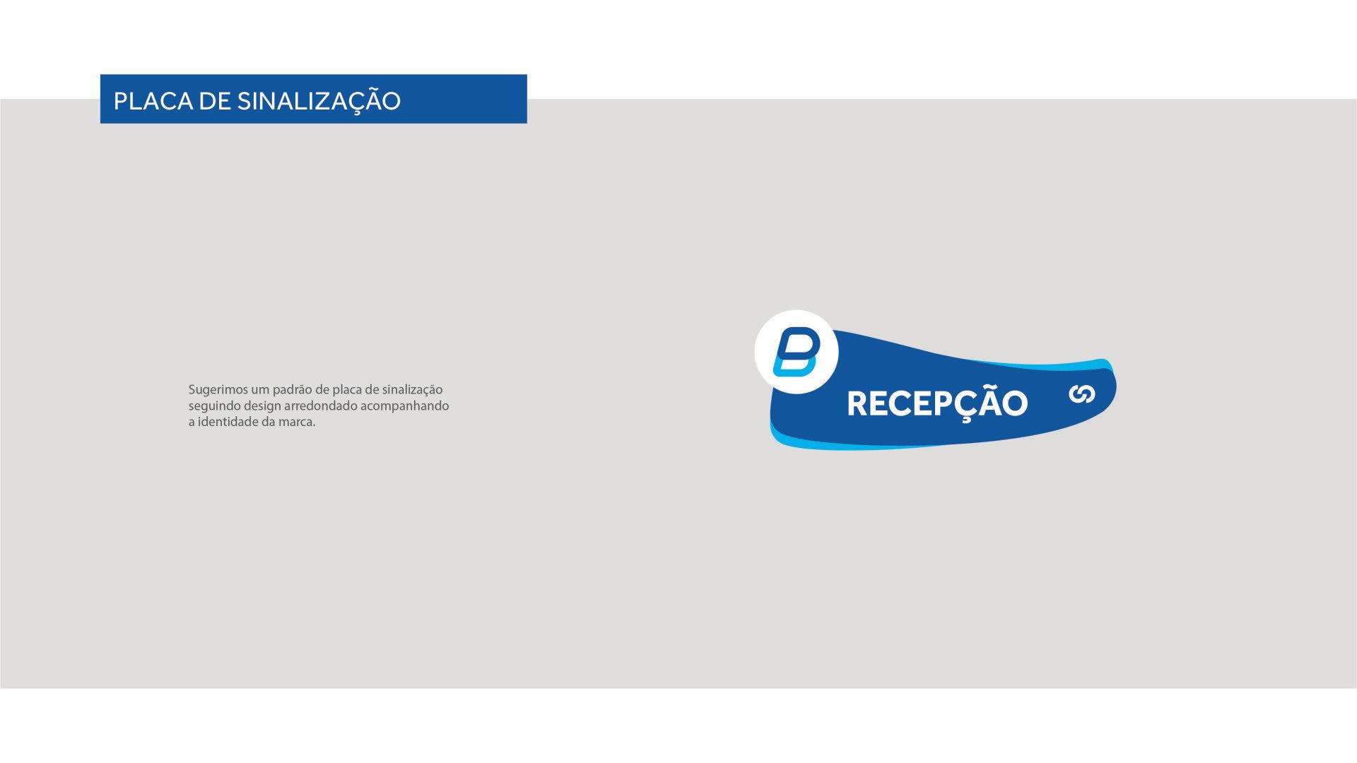
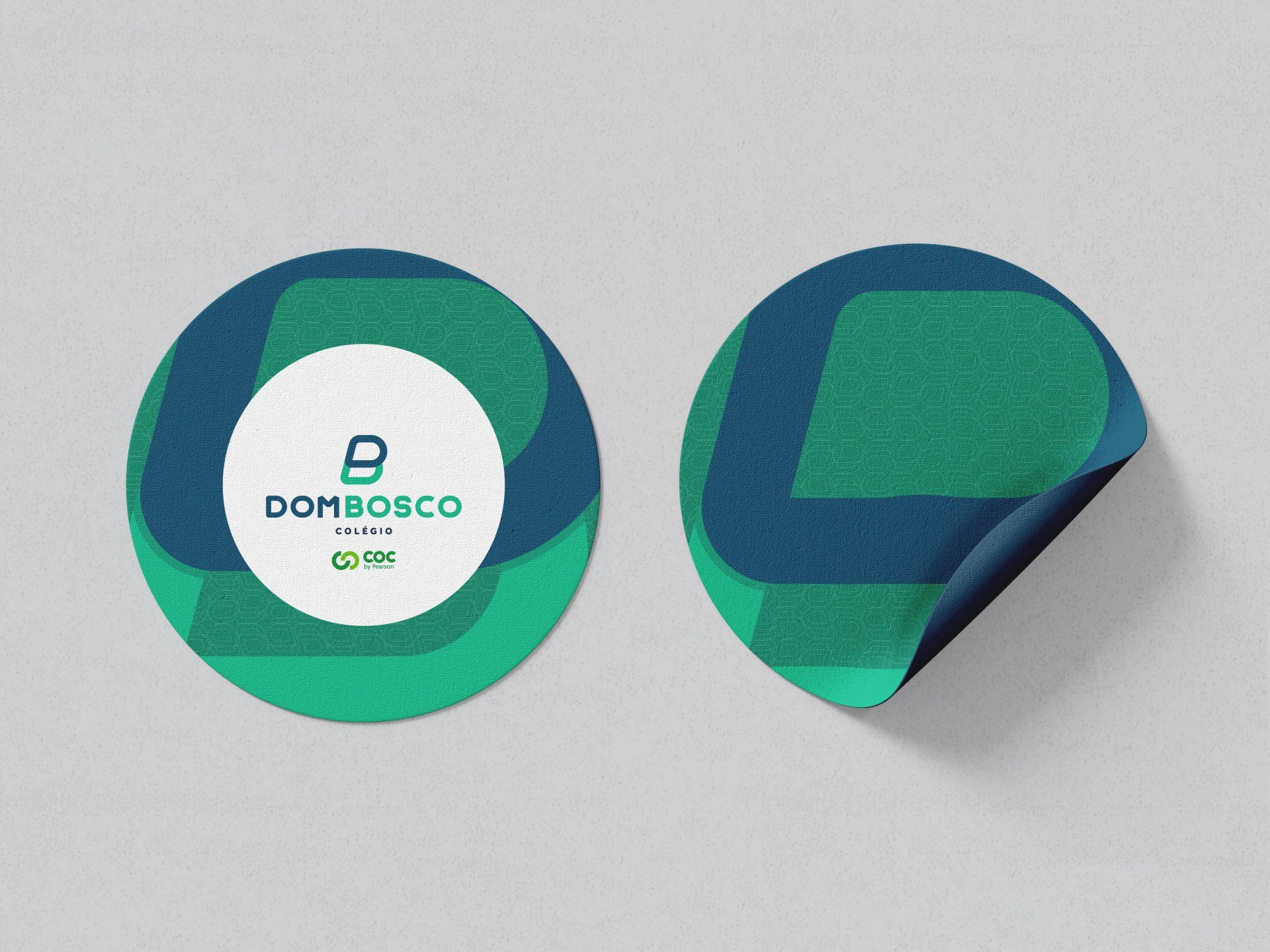
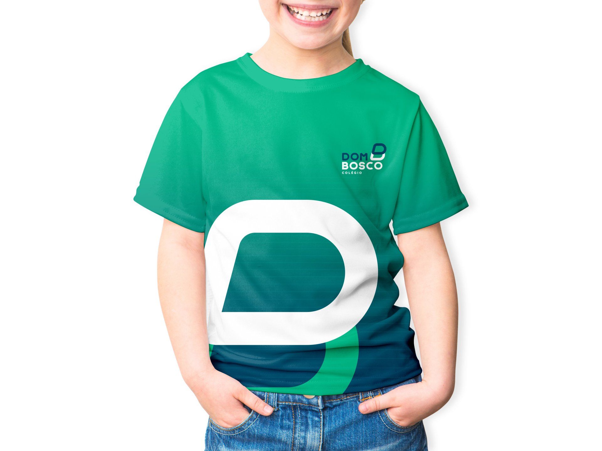
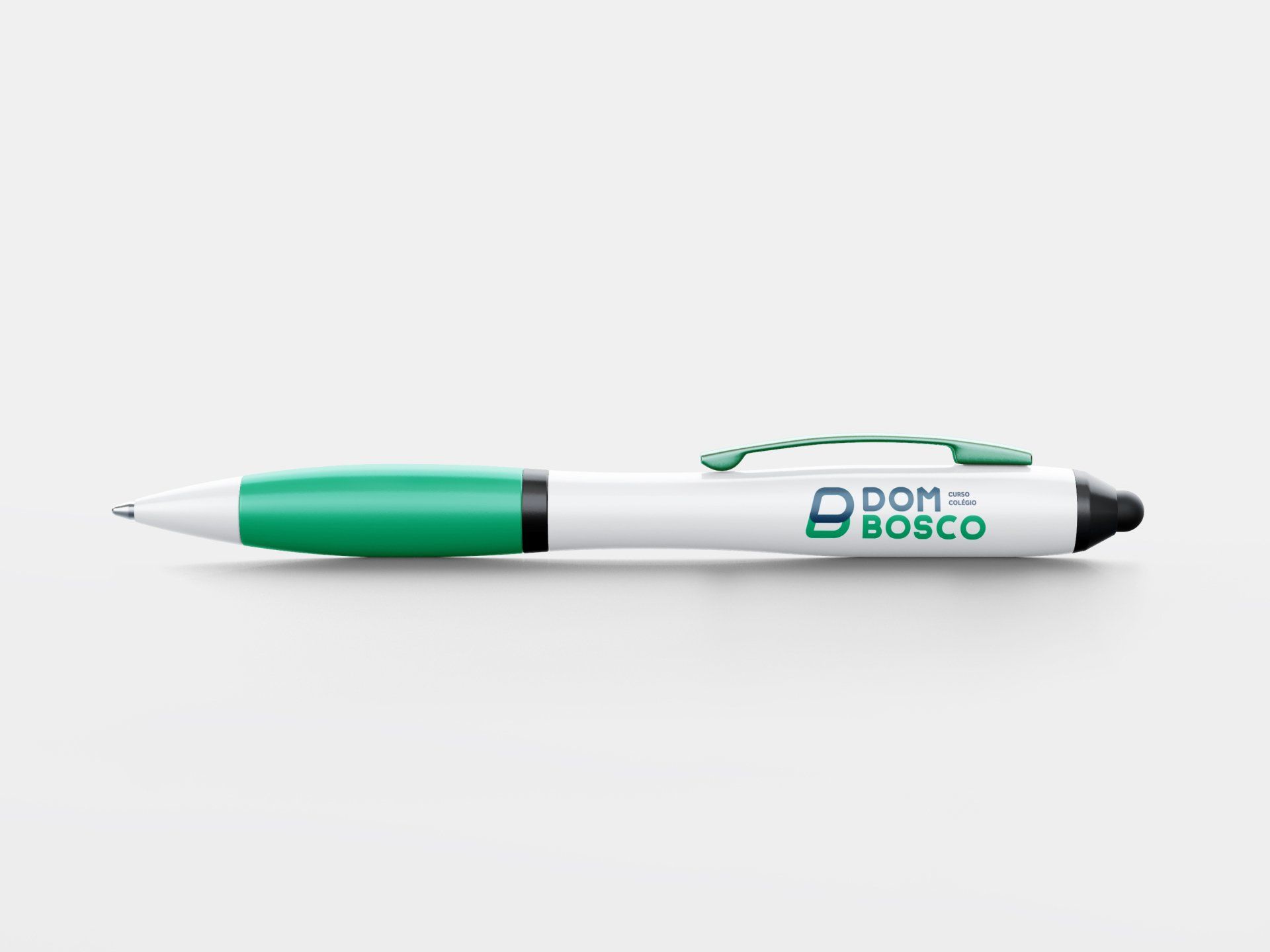
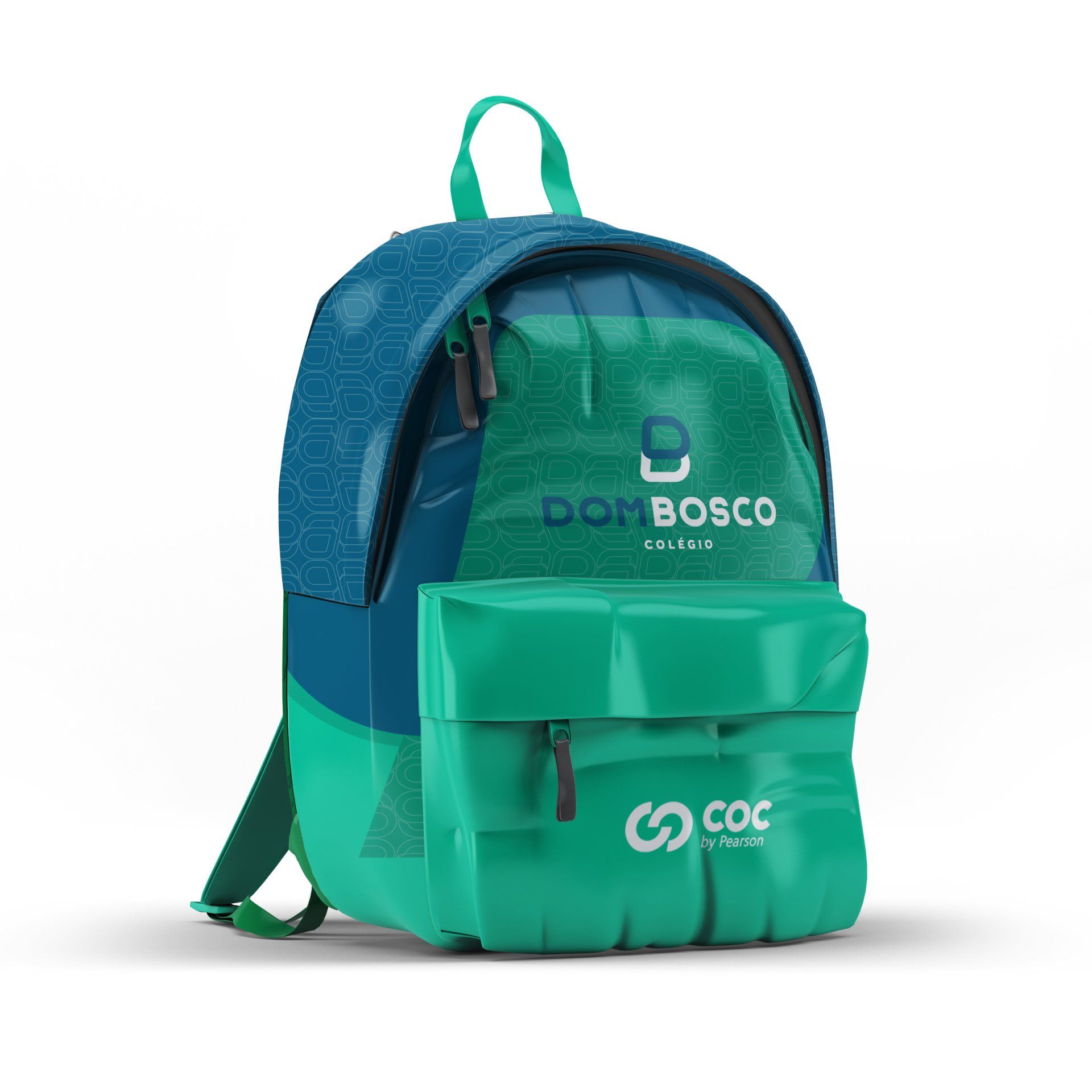
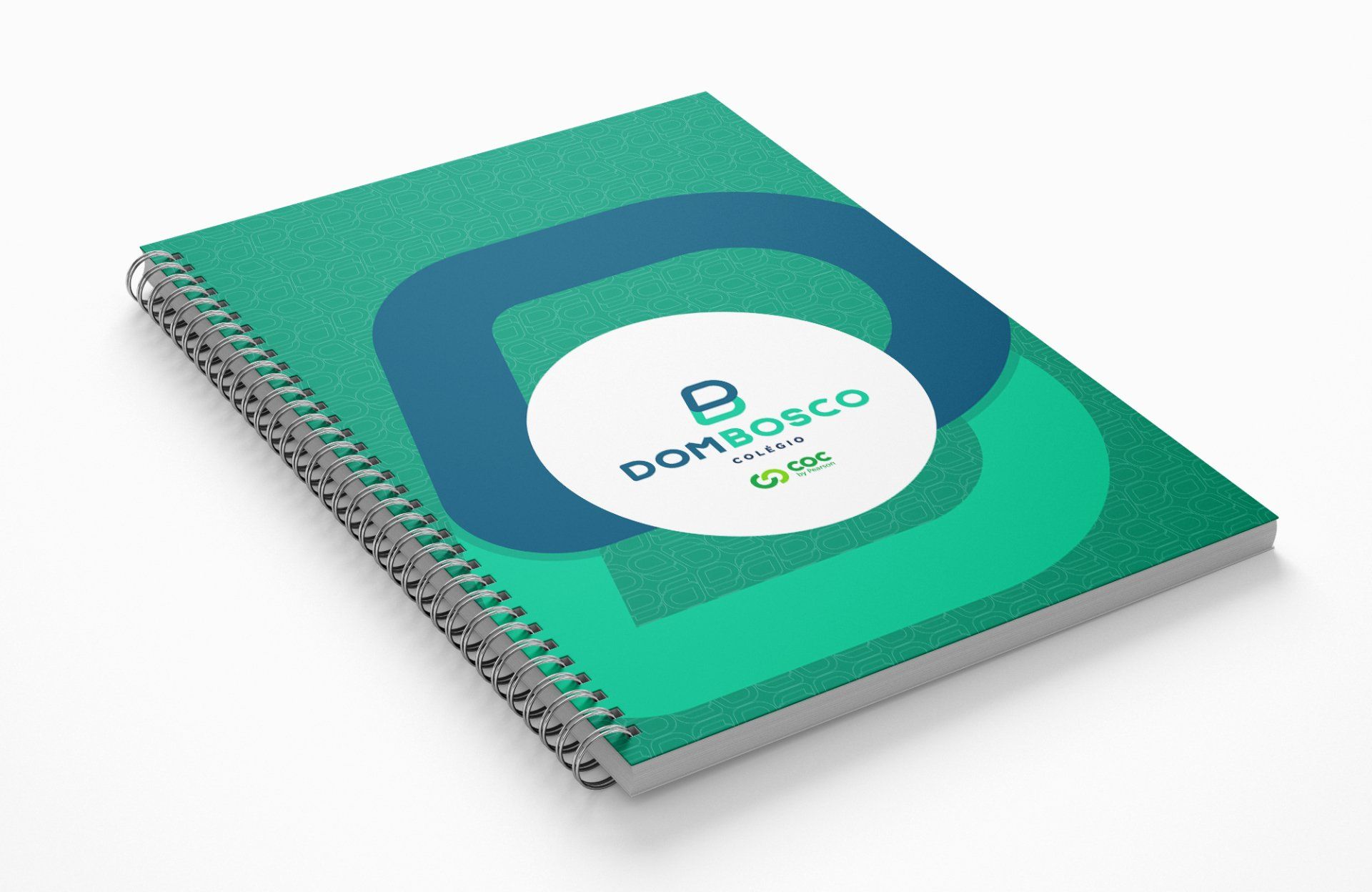
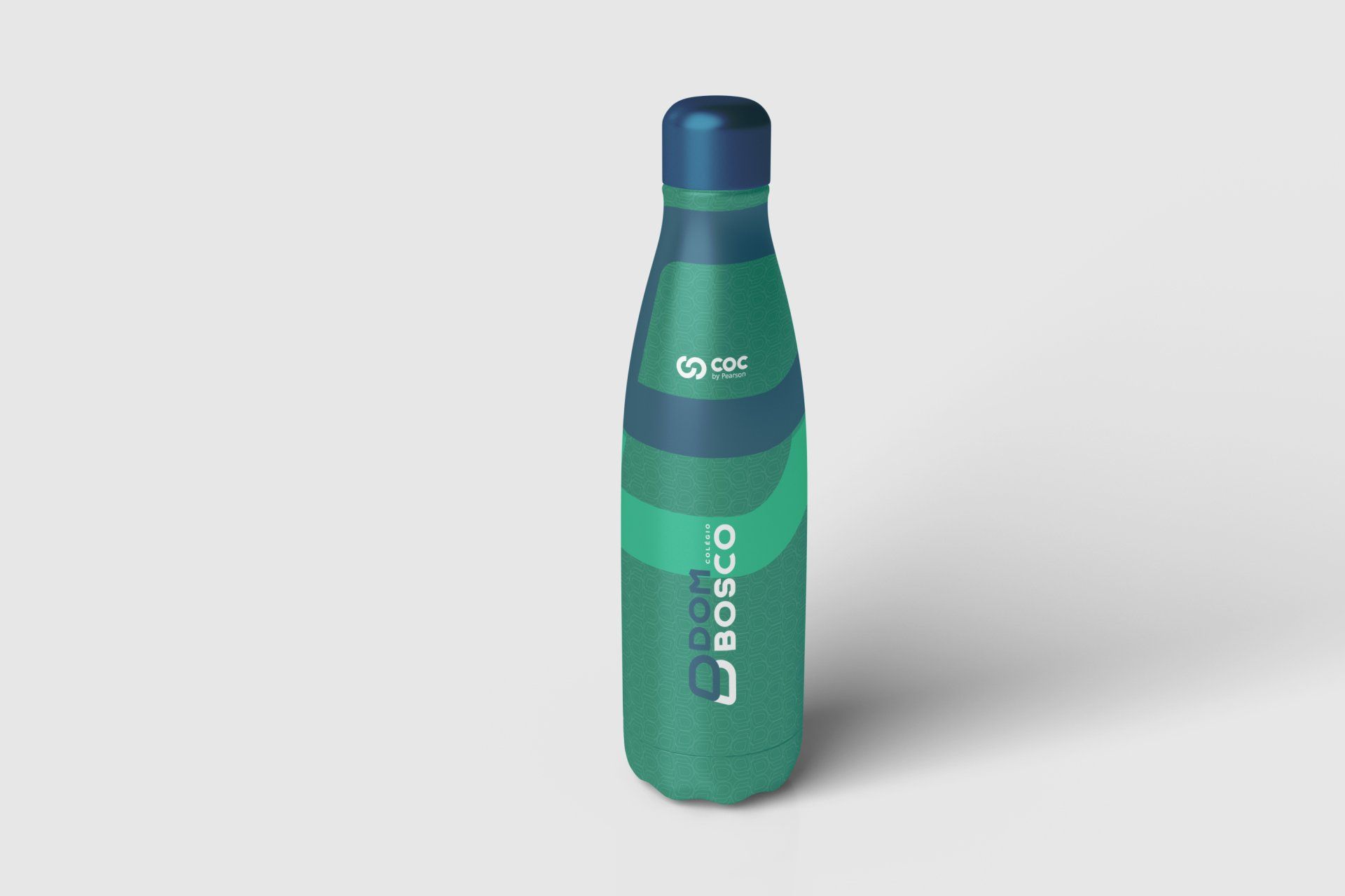
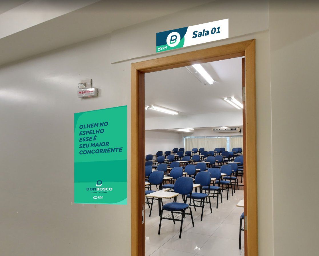
APPLICATION MANUAL MOCKUP SUGGESTIONS


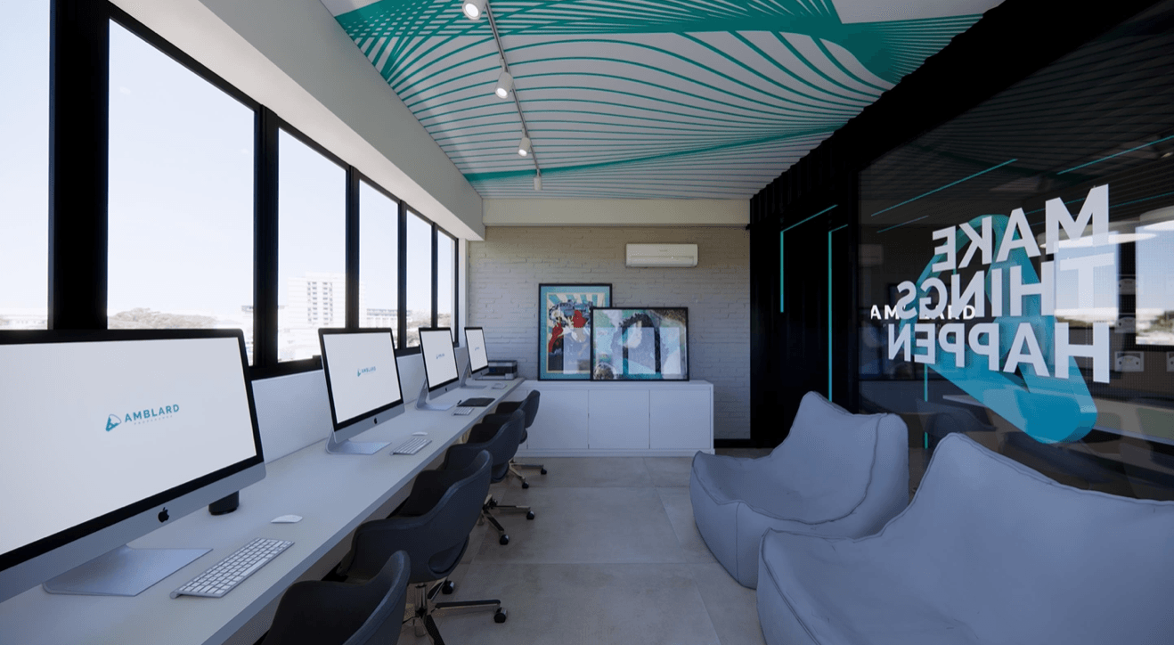
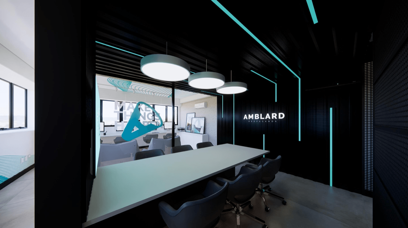
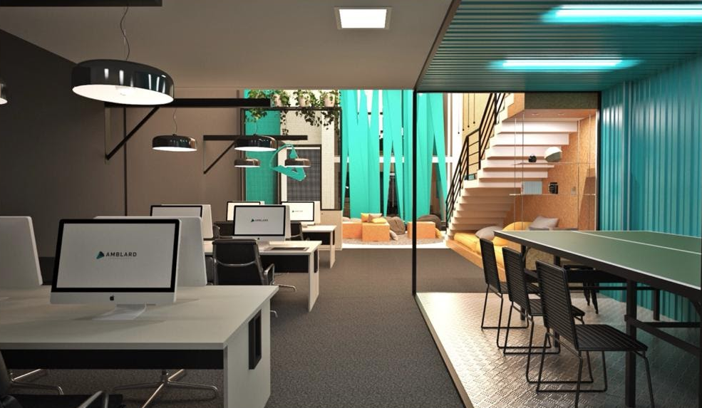
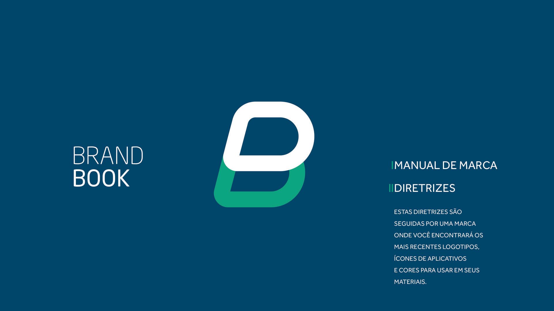
Our values
About Us
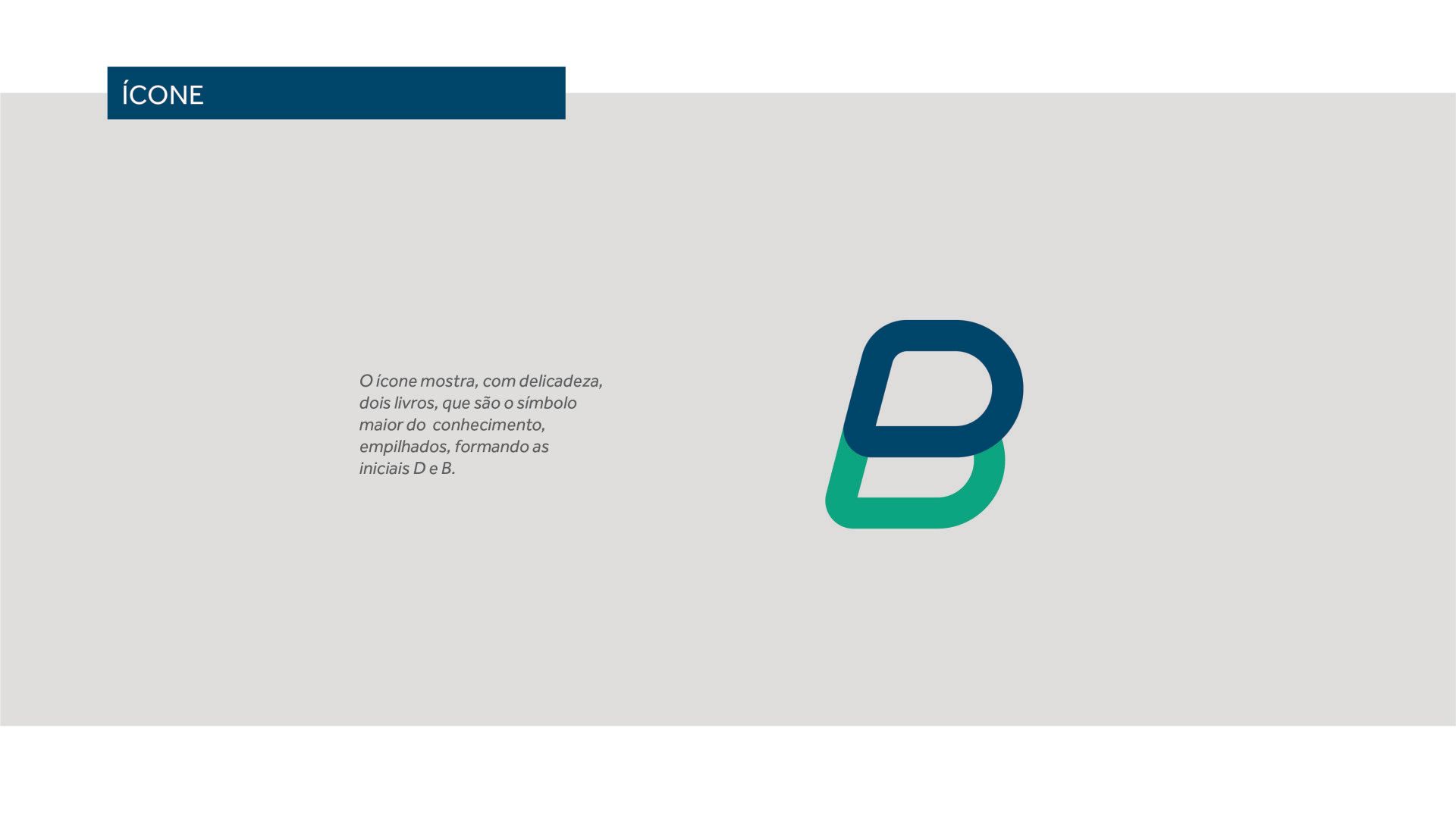
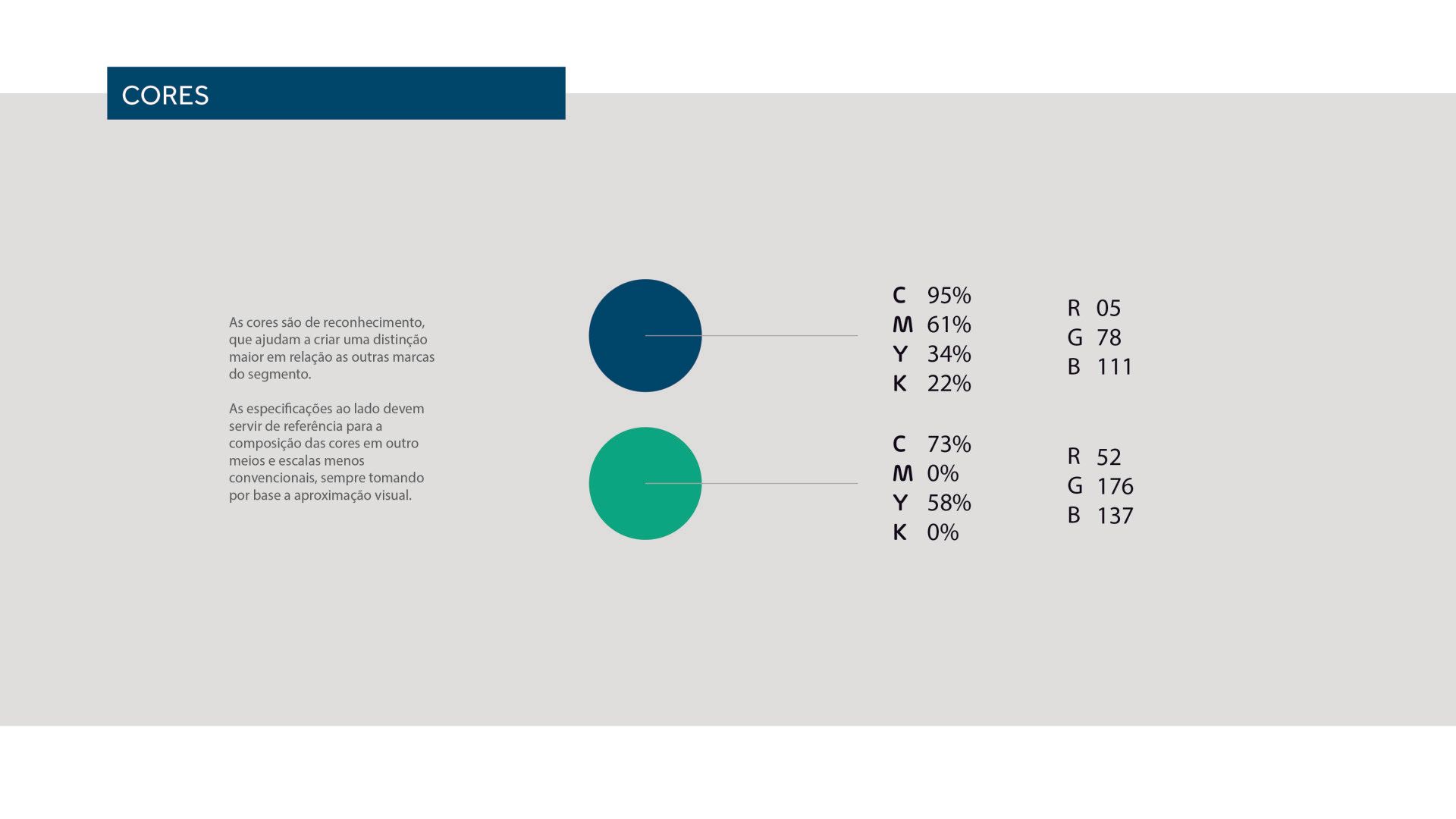
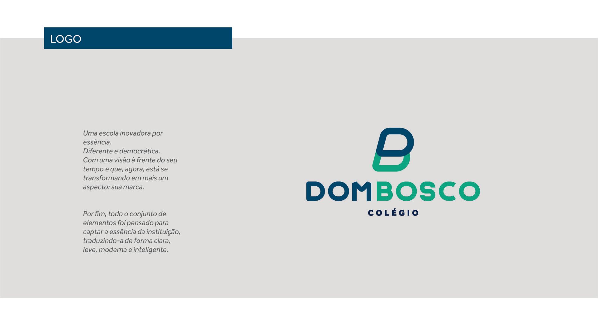
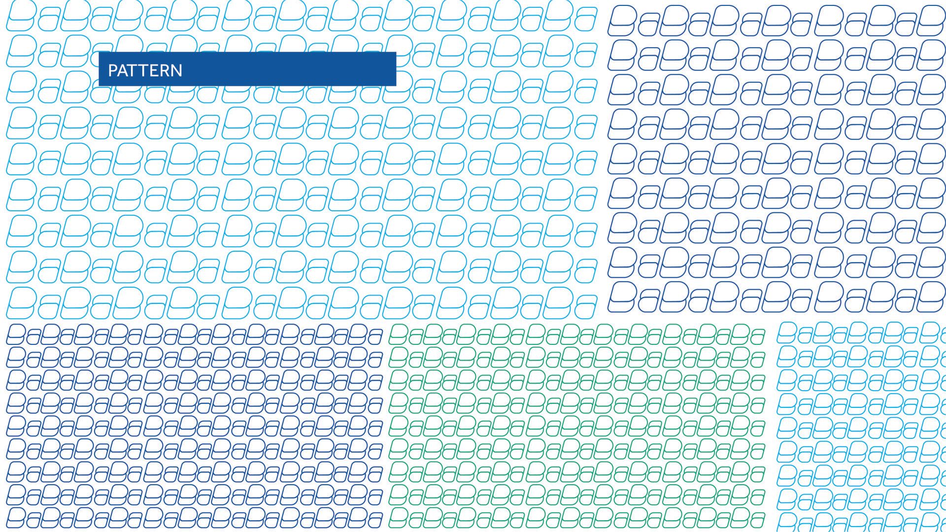
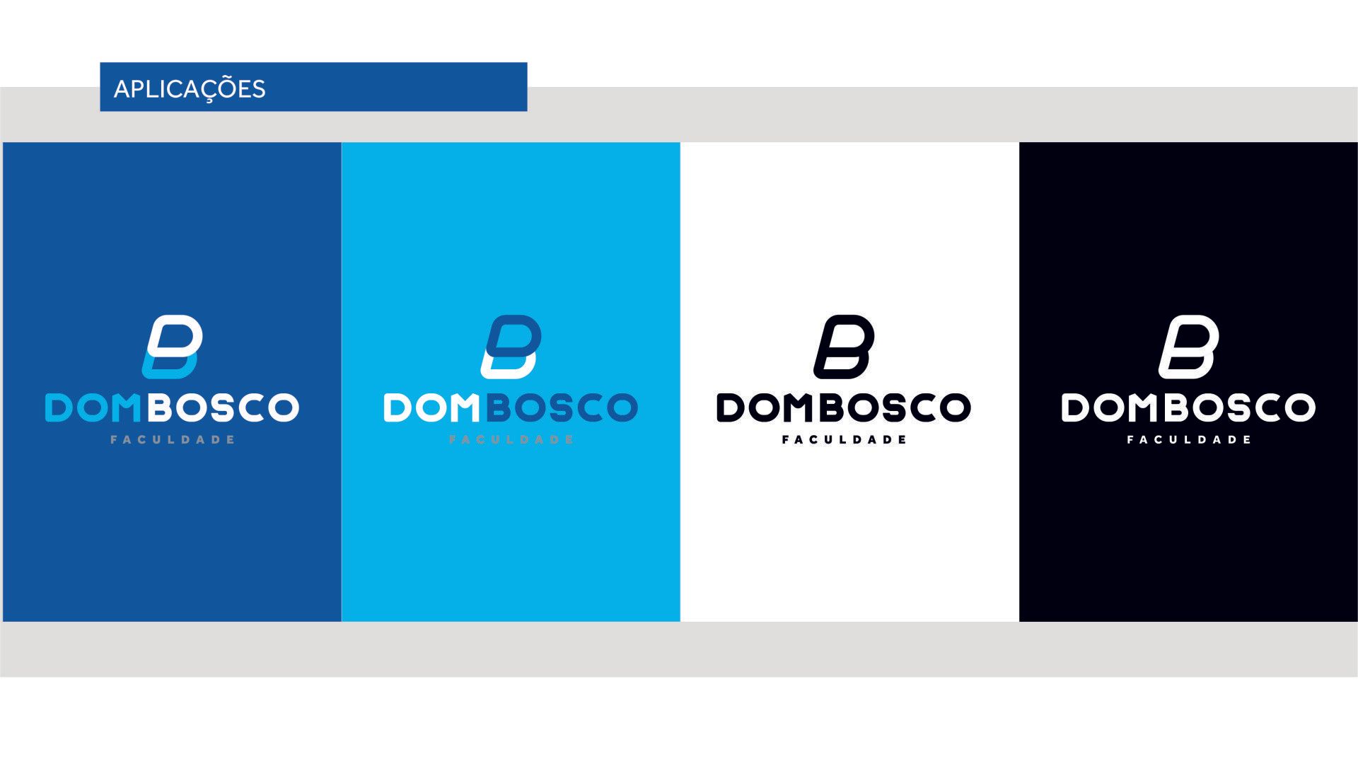
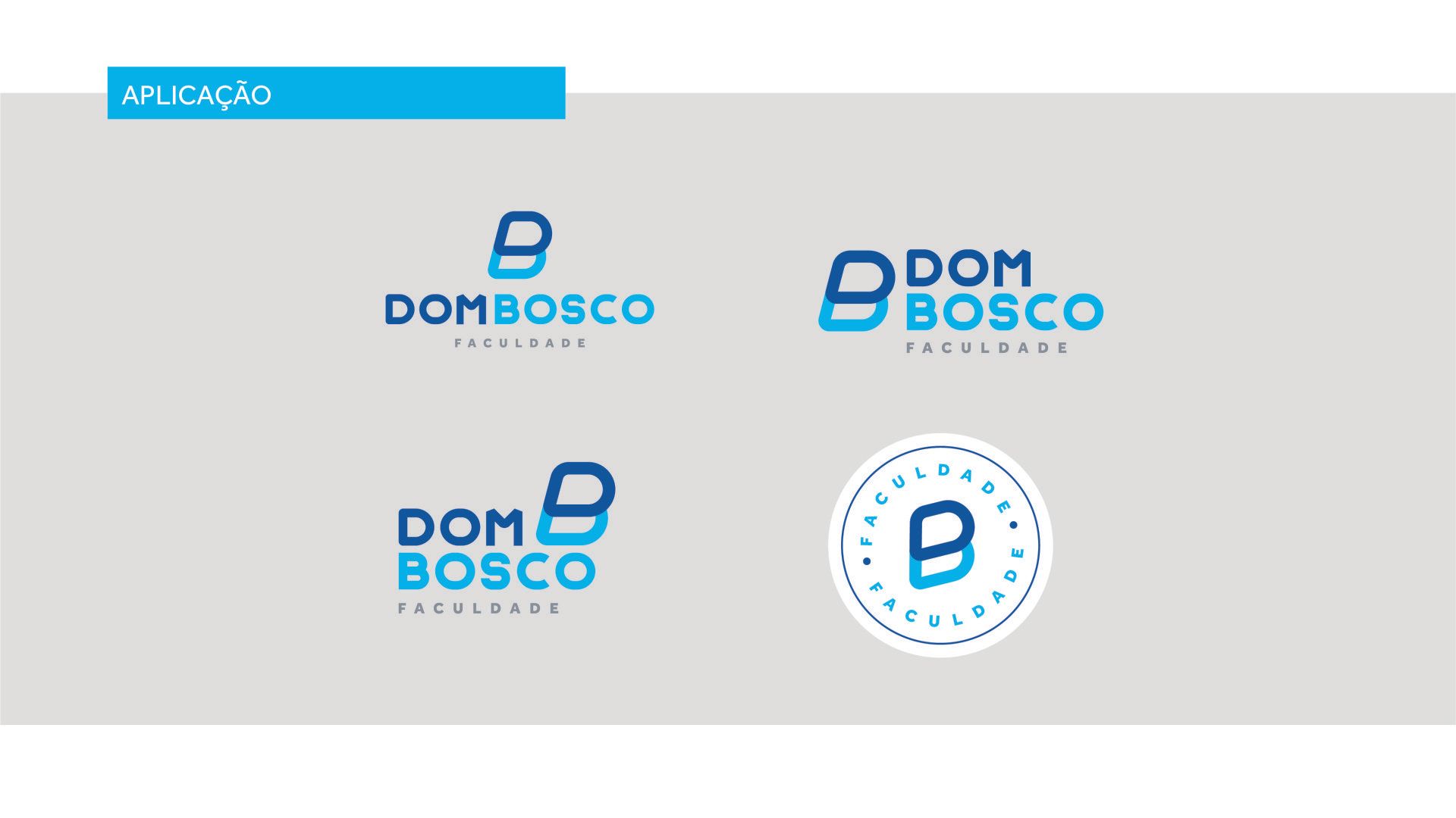
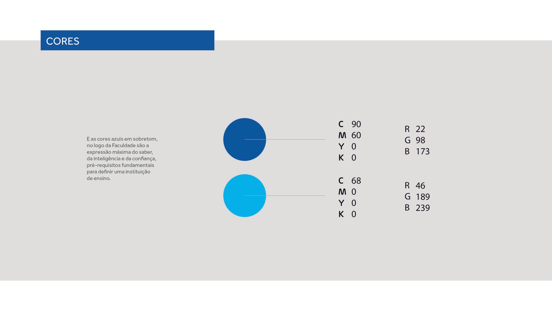
For the new identity of Colégio Dom Bosco, we looked for references of everything that translates knowledge, clarity, lightness, modernity and intelligence. The icon, with its delicate strokes and overtone blue colors, is the ultimate expression of knowledge, intelligence and confidence, fundamental prerequisites for defining an educational institution.
DATASHEET
Client - Prorelax Branding - Repositioning Sleep science now with a new face. Service - Andrea Creation Dir - Marcio Amblard Dir. of Art - Augusto and Marcio Approval - Alexandre
Is your brand positioned correctly?
Have a branding that represents your company and create passionate about it.
LET'S TALK
Leave your email so we can talk about your project, I'm sure that together we can do something different.
Thank you for contacting us. We will return as soon as possible